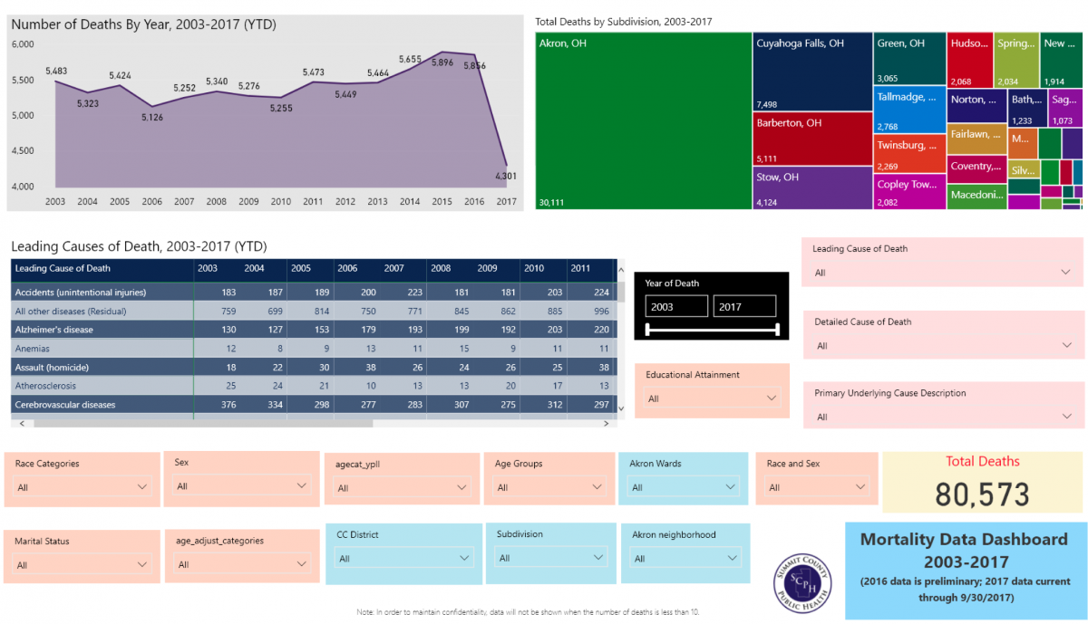
The SCPH Data Dashboards can enable you to create your own custom reports with data from Summit County. Each dashboard gives you the ability to filter data to the specific information you're looking for. For example, the image below shows how the "Death by Year and Causes" tab looks with no filters chosen:
No filters chosen:
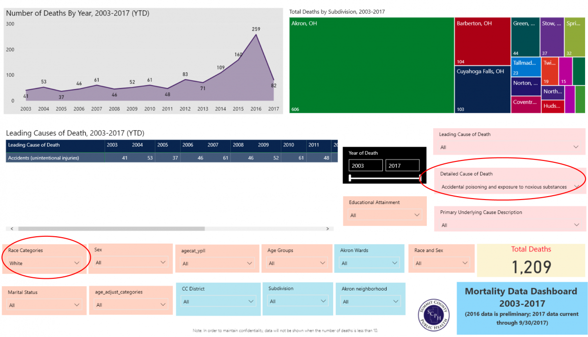
Below, the dashboard has been filtered by race (selecting "White" from the Race Categories dropdown menu) and by cause of death (selecting "Accidental poisoning and exposure to noxious substances" from the Detailed Cause of Death dropdown menu). The chart and table now show us data on drug oversode deaths in the white population:
Filters chosen:
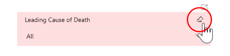
Clearing Filters:
To clear the selected filter, simply click on the small eraser icon at the top right of the filter:
Important Notes about Using the Data:
- In order to preserve confidentiality, all graphics, totals boxes and tables are set to produce BLANK results when the total number of cases is LESS THAN 10.
- Comparisons between different geographic areas and demographic groups should be done with caution. Communities with large populations such as Akron or Barberton are likely to have the highest number of people with both good and bad outcomes simply because of their size. In order to accurately compare one geographic area or demographic group to another, the raw numbers presented here should be converted into either a crude rate(showing a number as a rate per 1,000 persons) or age-adjusted rates (which account for the fact that most causes of death occur at older ages).
- Rates that are calculated using small numbers are unstable; in other words, a change of one or two cases in a sample of 10 or 20 could cause the calculated rate to rise or fall sharply from one time period to the next. Therefore, larger totals should be used if at all possible. This can be accomplished by adding years or like geographic areas together.
Notes about Specific Dashboards:
Birth Outcomes Data Dashboard
The Birth Data Dashboard has four tabs. The contents of each are briefly described below:
- Overall – This tab contains a line chart with the total number of births for each year, and key performance indicators that measure how well three key indicators match up with Healthy People 2020 goals; low birth weight, first trimester prenatal care, and premature births. The tab also contains filters related to the year of birth, mother’s age group, ethnicity, race, marital status, and community (municipality) of residence , with the size of each box determined by the proportion of total births that occurred in that community, as well as a total births box that adjusts the totals based on the filters chosen by the user.
- Maternal Demographics – This tab contains a line chart with the total number of births for each year and charts that show maternal demographic variables such as age, race, and ethnicity, The tab also contains filters related to the year of birth, mother’s age group, ethnicity, race, marital status, and community (municipality) of residence , with the size of each box determined by the proportion of total births that occurred in that community, as well as a total births box that adjusts the totals based on the filters chosen by the user.
- LBW and Premature Births - This tab includes two line charts that show the percentage of low birthweight births and premature births, tables presenting low birthweight and premature births by year and type, key performance indicators and filters, and totals boxes that adjust depending on the choice of filter.
- Prenatal Care – This tab includes a line chart that show the percentage of pregnant women receiving first trimester prenatal care, a chart showing the percentage of women who received prenatal care in each of the trimesters, the related key performance indicator, filters, totals boxes, and a box that calculates median gestational age which, like the totals boxes, adjust depending on the choice of filter.
Mortality Data Dashboard
The Mortality Data Dashboard has six tabs. The contents of each are briefly described below:
- Deaths by year and causes – This tab contains a line chart with the total number of deaths for each year, and a graphic that shows how many people died in each Summit County community, with the size of each box determined by the proportion of total deaths that occurred in that community.
- Deaths by age group and causes – This tab includes graphics presenting the number of deaths by age group, a graphic that shows how many people died in each Summit County community, filters for demographic variables, causes and diagnoses, community (called “Subdivisions” in the filters) and a total deaths box that adjusts the totals based on the filters chosen by the user.
- Leading causes - This tab includes a table of leading causes of death by year, a graphic that shows how many people died in each Summit County community, filters for demographic variables, causes and diagnoses, community, and a total deaths box that adjusts the totals based on the filters chosen by the user.
- Leading causes by educational attainment – This tab includes a chart of leading causes of death for all years, a graphic that shows how many people died in each Summit County community, a chart that presents number of deaths by level of educational attainment, filters for demographic variables, leading causes and diagnoses, community, and a total deaths box that adjusts the totals based on the filters chosen by the user.
- Infant deaths by year and cause – This tab contains a line chart with the total number of infant deaths for each year, and a graphic that shows how many people died in each Summit County community, with the size of each box determined by the proportion of total deaths that occurred in that community. The tab also contains filters for demographic variables, causes and diagnoses, community, and a total infant deaths box that adjusts the totals based on the filters chosen by the user.
- Deaths by geography – This tab contains total deaths by census tract, zip code, and community, and contains filters for demographic variables, causes and diagnoses, community, and a total infant deaths box that adjusts the totals based on the filters chosen by the user.
Drug Overdose Emergency Department Visit Dashboard
“Overdose” cases include all emergency visits to a Summit County medical provider in which drugs were identified as the cause of traumatic injury. Overdose cases were further refined by selecting only those cases where the case notes included the terms “OD” or “overdose.” Traumatic injuries due to drugs caused by suicide attempts, allergic reactions to normal medications, or accidental overdoses of everyday drugs (such as Tylenol or Ibuprofin) were removed where identified. Zip codes refer to the zip code of residence of the patient visiting the ER. Data cited in this report represents the full-day totals from the day before the report's release. It is important to note that these are estimated figures rather than a full and final count because initial diagnoses and/or details of a particular case may change from a patient’s initial examination to his or her final outcomes, and because the limited case notes field in may not include all details necessary to firmly classify a case as an overdose. It is also important to note that case notes available through rarely identify the specific drug or drugs involved in an overdose. Therefore the figures here can be associated with any drug, not just heroin and/or fentanyl.